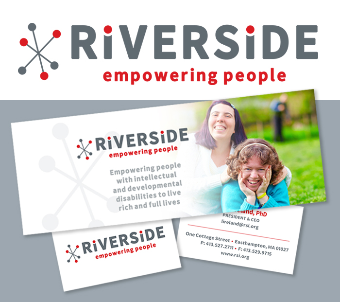
Kathleen recently collaborated with Riverside to redesign their logo and brand identity.

The goal of this months-long process was to give Riverside a fresh, cohesive look that better reflected the services they offer their clients and the community. The decision was made to remove “Industries” from their title, as their services today have expanded far beyond the industrial focus of when the organization was founded over 50 years ago.
The new logo needed to represent Riverside’s core values and their focus on their clients. Each individual receiving services has their own goal – Riverside adapts each process to meet their needs with teamwork, progressive ideas, and technology. The new logo is friendly and welcoming, incorporating abstract designs that represent people and connectivity. The simplified tagline showcases Riverside’s main mission.
The logo also needed to be versatile in its application, to be used large, small, in color, black and white, in print, on signage and on the web. Kathleen created additional materials including print collateral, signage designs, and social media graphics.
Kathleen worked closely with Bob Burch at Bright Cloud Studio throughout this process, as the rebranding project also included a new website. Bright Cloud Studio created a fresh, dynamic website that is easy to use, accessible, and that highlights Riverside’s services.
For over 50 years, Riverside has provided individualized services combining life skill development, day habilitation, and employment options for adults living with intellectual and developmental disabilities (IDD) in the tri-county region of Western Massachusetts.
